Graphic design is where my career started, and it’s still the lens I bring to everything else I build — websites, brand systems, presentations, print. Long before I was writing code or managing platforms, I was making decisions about type, space, and hierarchy, and those decisions are still what I think about first.
Good design, to me, comes down to a handful of fundamentals done well: choosing typography that fits the tone of the piece, establishing a clear hierarchy so the eye knows where to go first, giving elements enough margin to breathe, sizing things in proportion to their importance, and paying attention to how every element relates to the ones around it. None of that is flashy. It’s the quiet work that makes a piece feel intentional instead of just assembled.
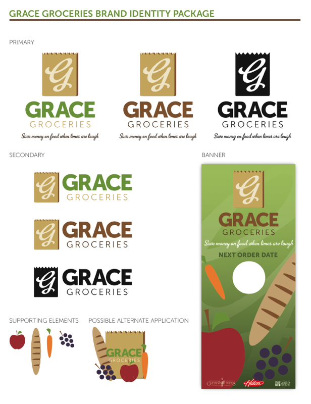
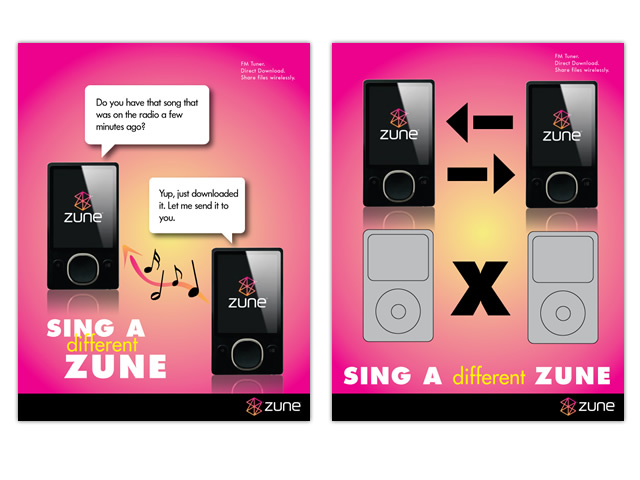
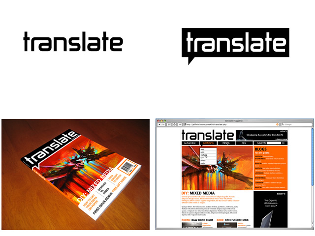
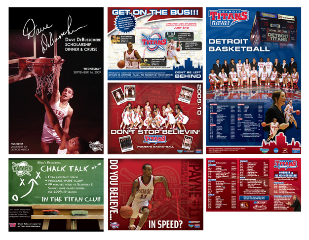
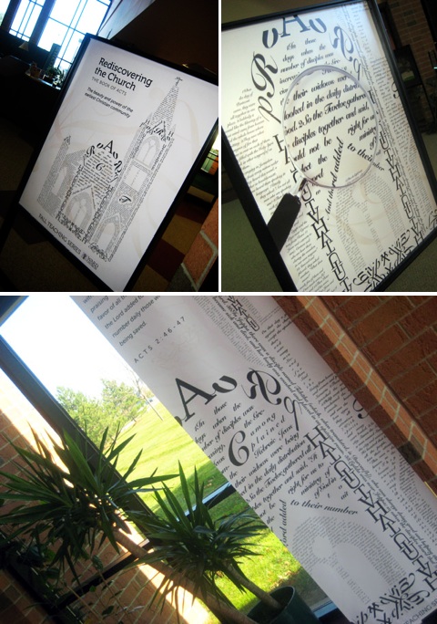
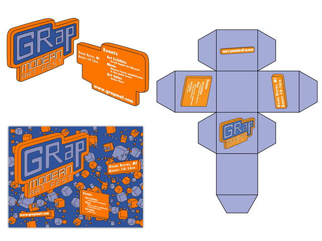
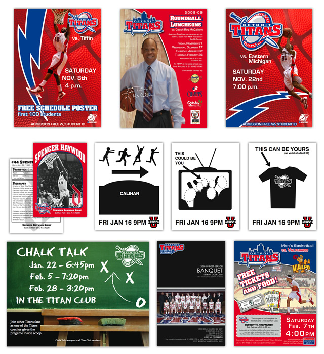
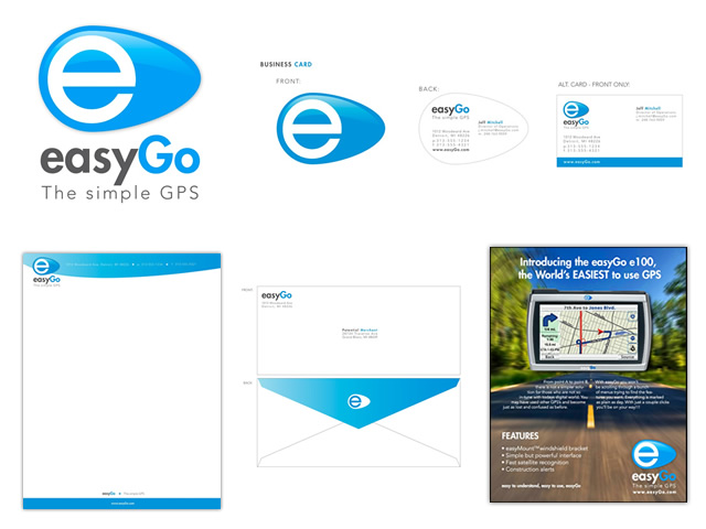
The gallery below is a sampling of design work from over the years — branding, print, digital, and everything in between — rather than a single project case study. It’s less about any one outcome and more about a consistent way of thinking that shows up across all of it.
What I Focus On
- Typography choices that match tone and readability
- Clear visual hierarchy so the eye knows where to land first
- Margin and whitespace as a deliberate design tool, not empty space
- Sizing and scale that reflect importance
- How individual elements relate to and reinforce each other