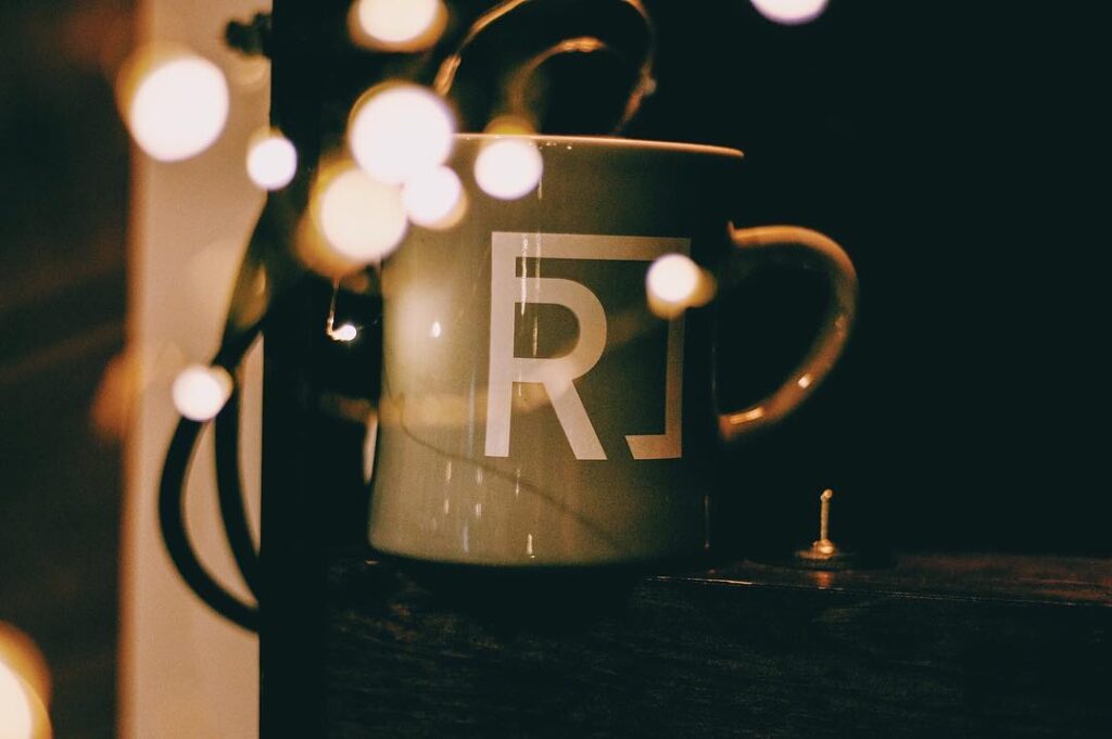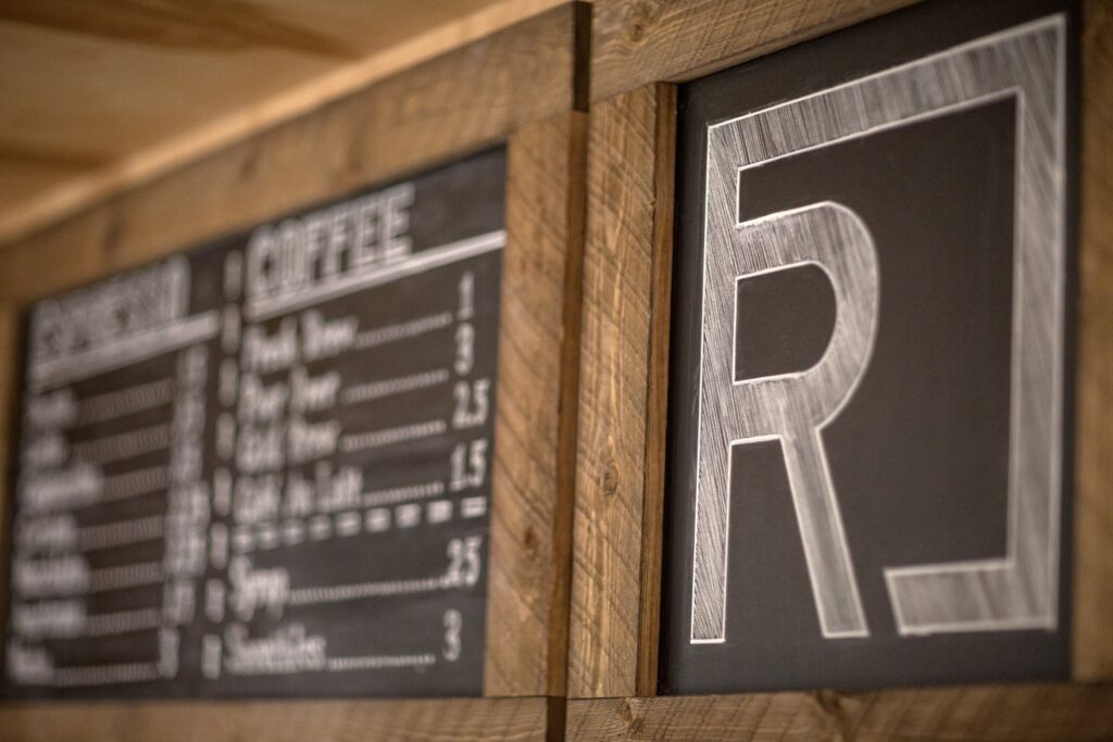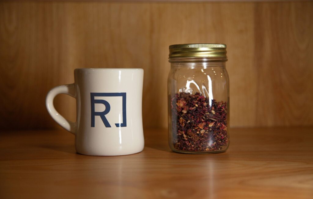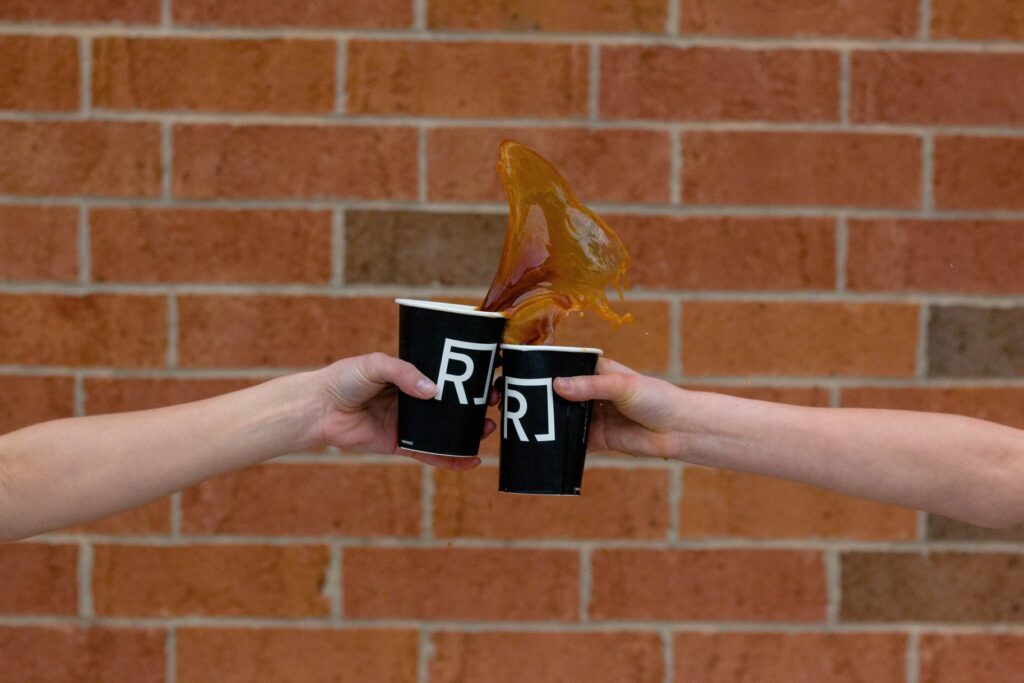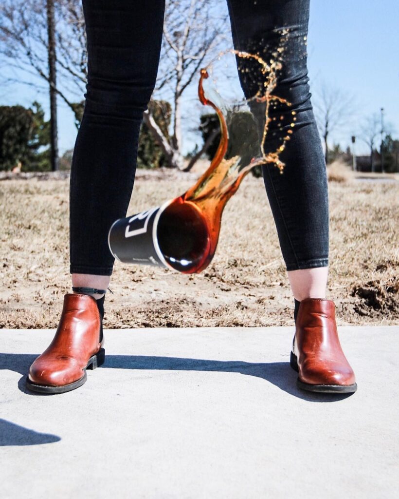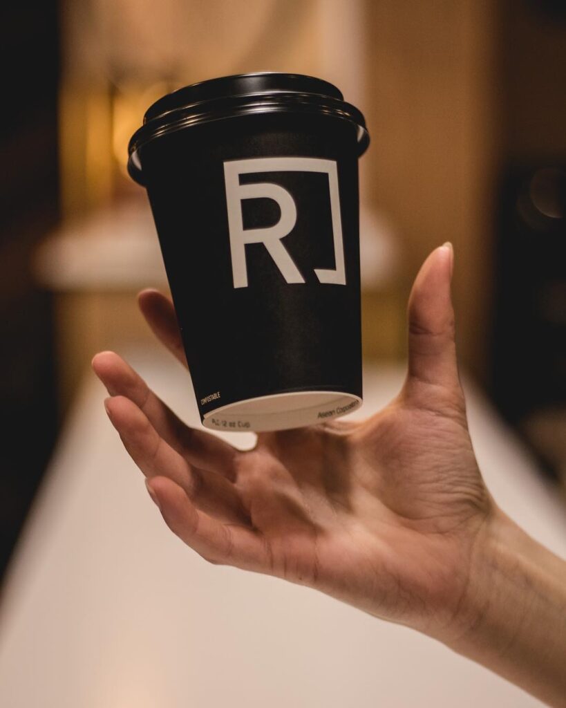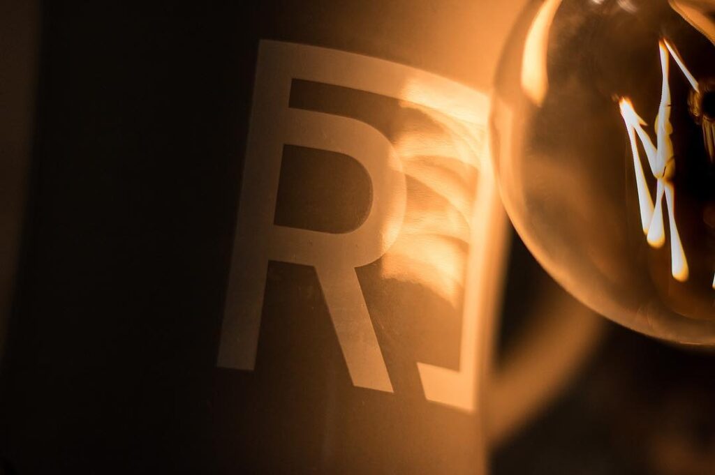
I developed the full brand identity for ReNu Coffee, a community‑focused shop in Northville, Michigan, built around the idea of renewal, rebirth, and the revitalization happening through a partner nonprofit in Detroit. The brand needed to reflect both the craft of specialty coffee and the mission‑driven work of transforming reclaimed materials and forgotten spaces into something new. Drawing on this concept of cyclical renewal, I created a logo built from a customized “R” locked inside a square—referencing the upcycling theme while aligning with the parent brand’s core typography and negative‑space system.
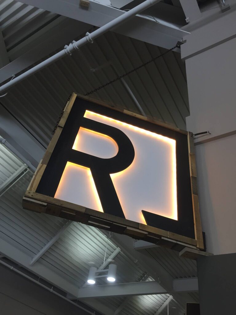
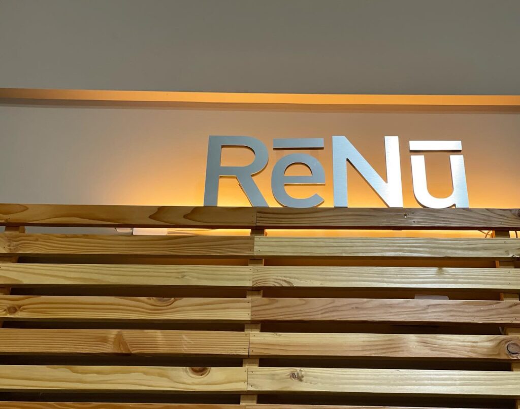
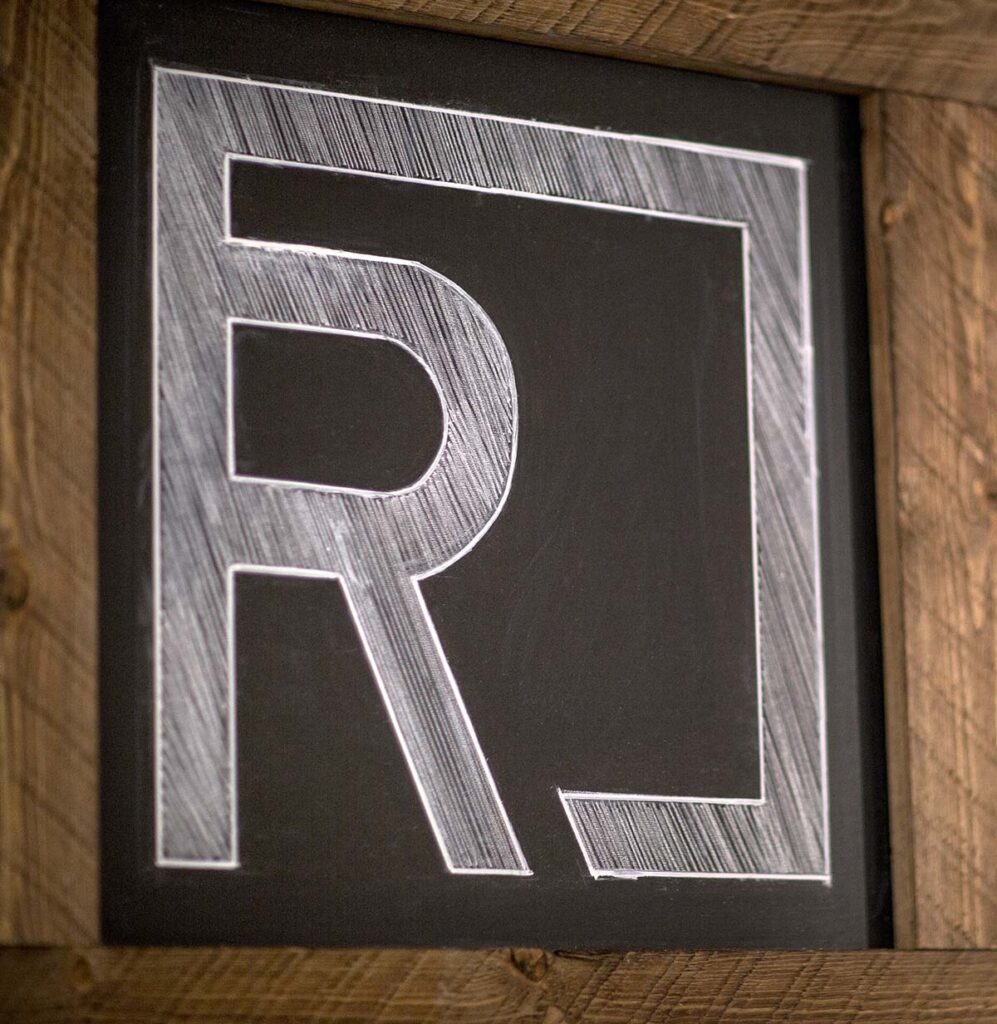
Beyond the identity, I collaborated directly with the nonprofit’s artisan to design the shop’s exterior signage. The final piece was constructed from reclaimed wood sourced from abandoned Detroit buildings, then integrated with custom LED lighting to create a modern, welcoming presence that honors the brand’s origins. The full identity package extended across signage, print materials, and digital applications, maintaining consistency with the broader parent brand while giving ReNu Coffee its own distinct character.
Features & Highlights
- Brand identity rooted in the concept of renewal, rebirth, and urban revitalization
- Custom “R” logo designed to align with the parent brand’s font and negative‑space elements
- Symbolic mark representing cyclical upcycling/renewal within a clean geometric form
- Full identity package including logo, color palette, typography, and visual direction
- Collaboration with artisan to design reclaimed‑wood signage from Detroit materials
- Integrated LED lighting for a functional and eye‑catching exterior sign
- Cohesive brand system extending across environmental, packaging, merchandise, print, and digital touchpoints