
BRANDING
WardKids started as a naming problem. Ward Church’s children’s ministry had three age groups each carrying its own disconnected name — Butterfly Garden for the nursery, Bullfrog Bay for the preschool, and Splash Zone for elementary — with nothing tying them to the church brand. When the church decided to unify the ministry under one name, I was given the name WardKids. Stylizing it as one word, with a capital W and K, was a decision I made from there.
I designed the full identity myself — a custom logomark and a differentiated color and shape system for each age group — then worked with PlainJoe Studios’ creative team, who took the branding and executed how it would actually look and feel in the physical spaces. That project had its own challenges: the children’s ministry team knew they wanted the logo and colors integrated, but didn’t have a clear picture of what it should look like in the room. I served as the liaison between the ministry team and PlainJoe’s creative department, working through a lot of back-and-forth to steward the vision to a final product everyone was happy with.
CREATIVE DIRECTION
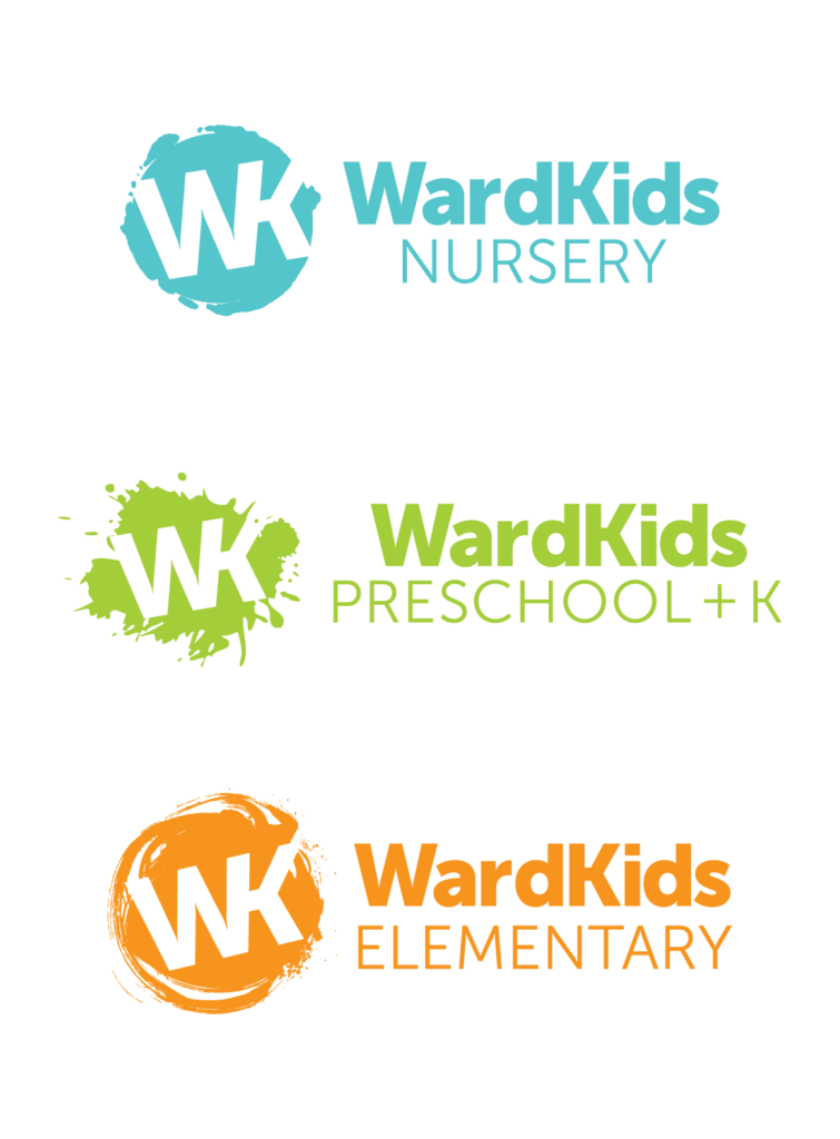
The logomark combines the W and K into a single connected mark, built in Illustrator using Museo Sans, the church’s brand font at the time. Each age group got its own color and shape treatment, designed to reflect the developmental stage of the kids in that space:
- Nursery — a soft teal paired with a gentle, rounded shape inspired by a newborn handprint or footprint. It’s a nod to the common practice of taking a newborn’s hand or foot, dipping it lightly in paint, and pressing it gently onto paper — something tender and deliberate rather than messy
- Preschool — a vibrant green paired with a chaotic paint-splat shape, capturing the energetic messiness of toddlers
- Elementary — Orange, chosen because Ward Church used the Orange curriculum from reThink Group at the time, paired with a swirl shape that’s more focused and intentional than the preschool mark, reflecting a child’s growing control
FEATURES & HIGHLIGHTS
- Custom W+K logomark designed in Illustrator from the church’s existing brand typeface
- Three-tier color and shape system differentiating nursery, preschool, and elementary
- Orange doubled as the unifying color for combined, all-ages kids’ ministry branding
- Unified three previously disconnected program names under one cohesive brand
- Partnered with PlainJoe Studios to bring the branding into physical environmental design, serving as creative liaison through an extended collaborative process